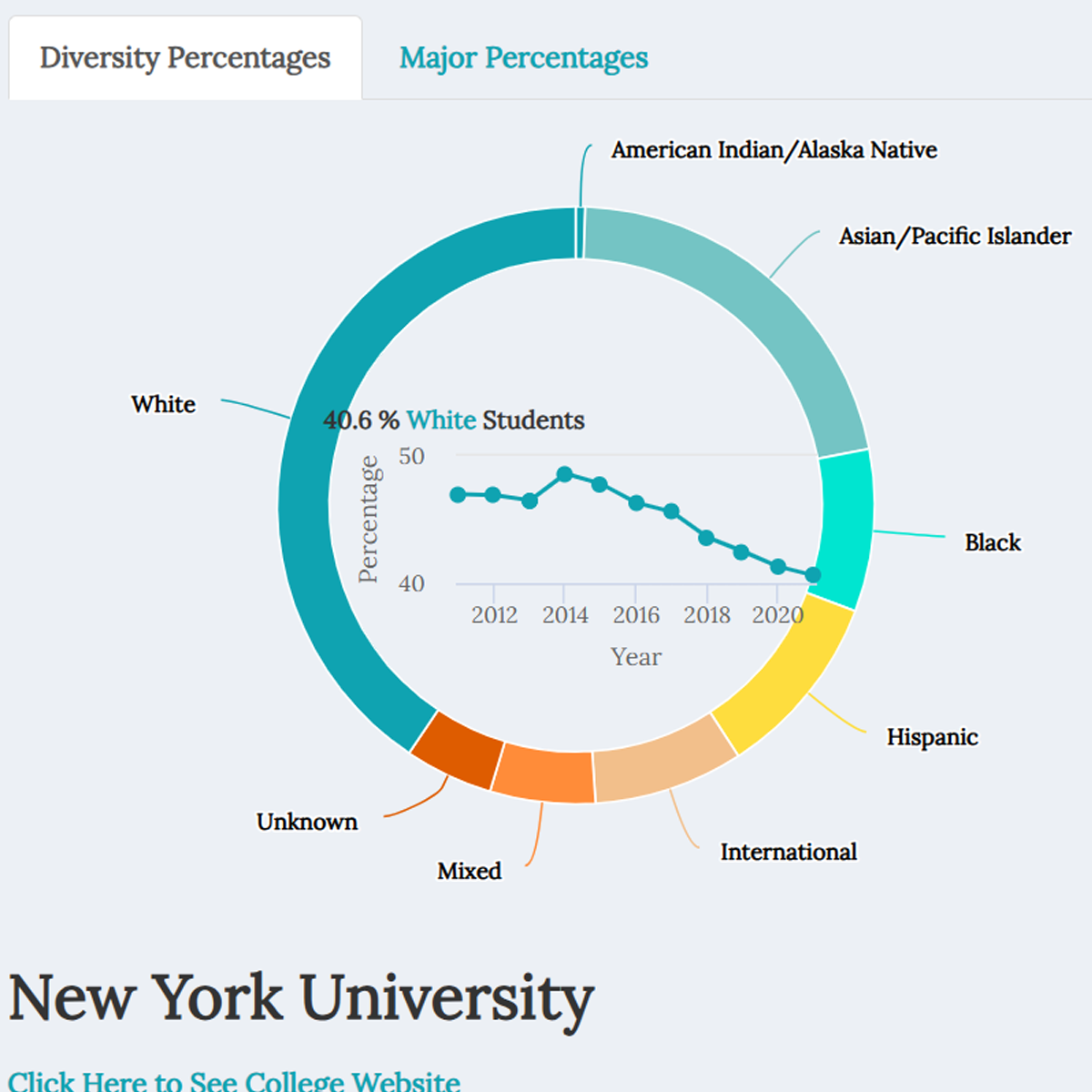
Everything College Dashboard
Dashboard for comparing US colleges side by side.
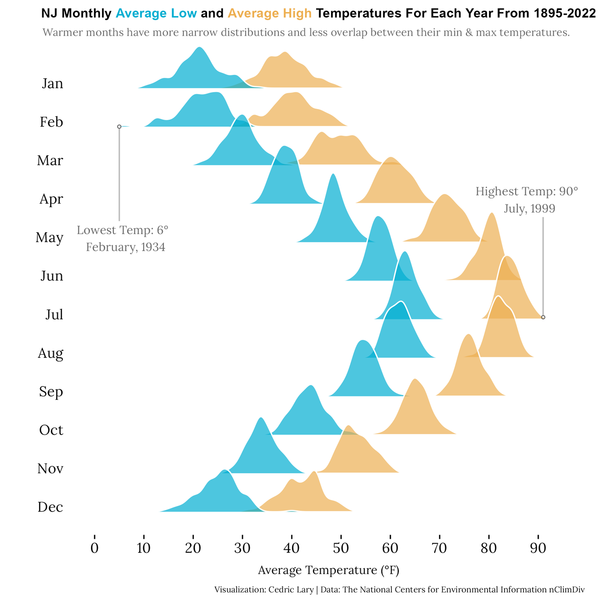
NJ Monthly Average Low and Average High Temperatures For Each Year
Graph showing NJ lows and highs from 1895-2022.
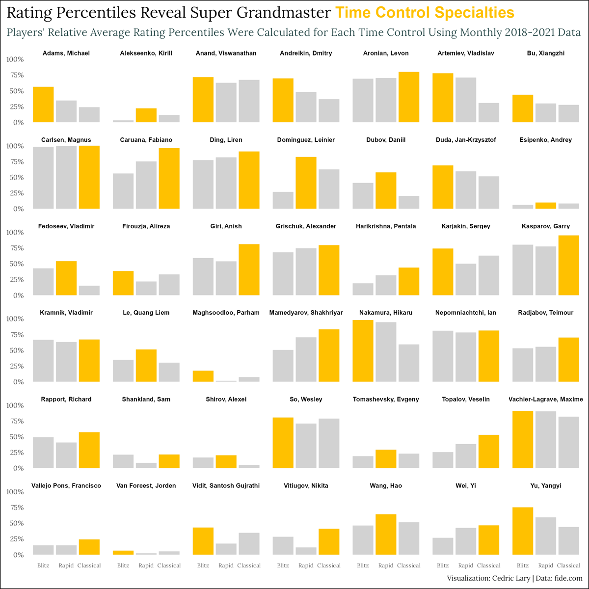
Rating Percentiles Reveal Super Grandmaster Time Control Specialties
Comparison of top grandmaster ratings using average percentiles.
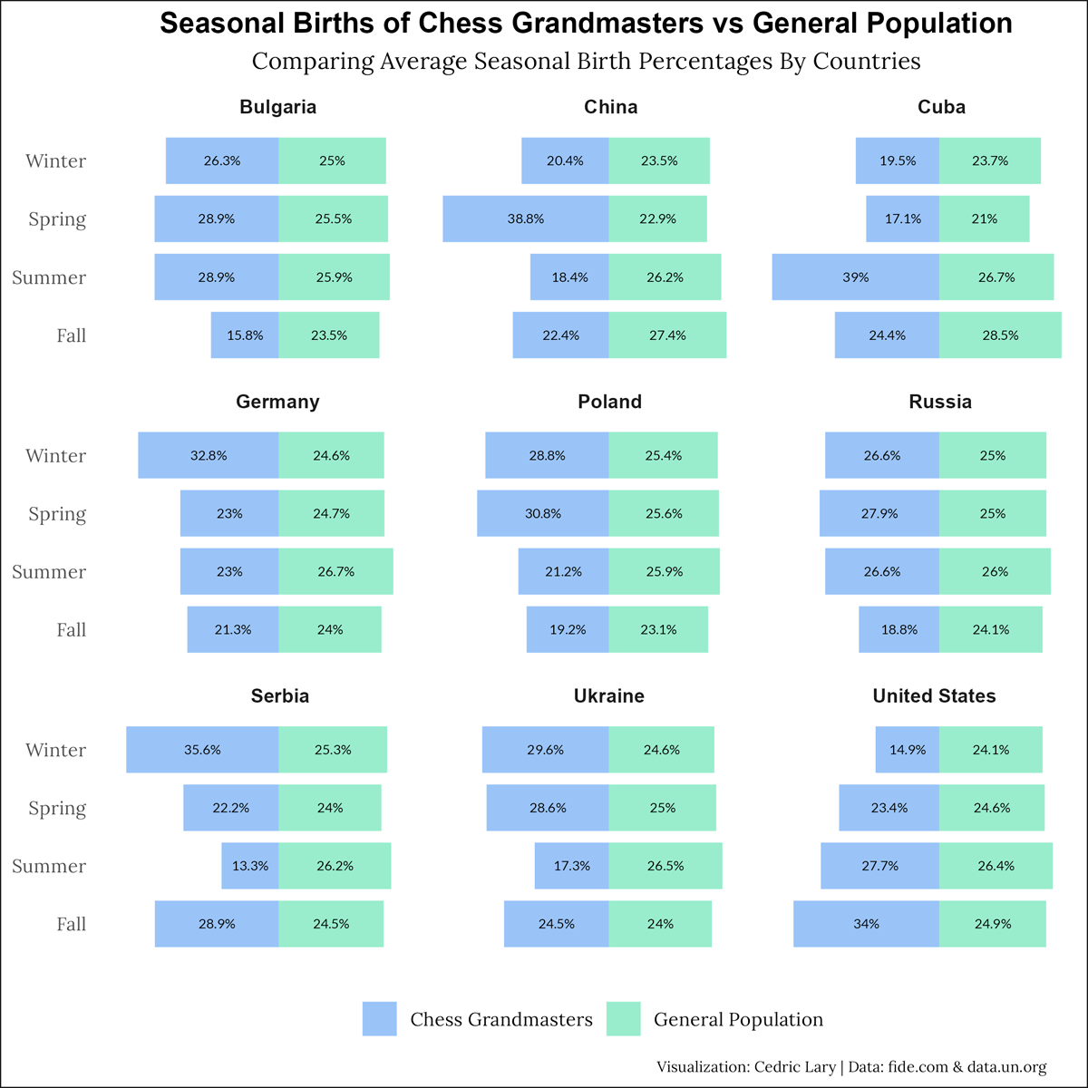
Seasonal Births of Chess Grandmasters vs General Population
Dashboard for comparing US colleges side by side.
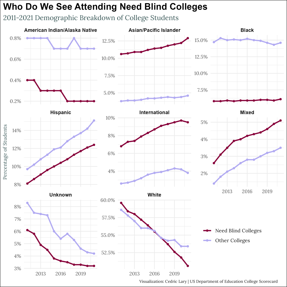
Who Do We See Attending Need Blind Colleges
Visualization showing trends in racial groups across need-blind and other colleges.
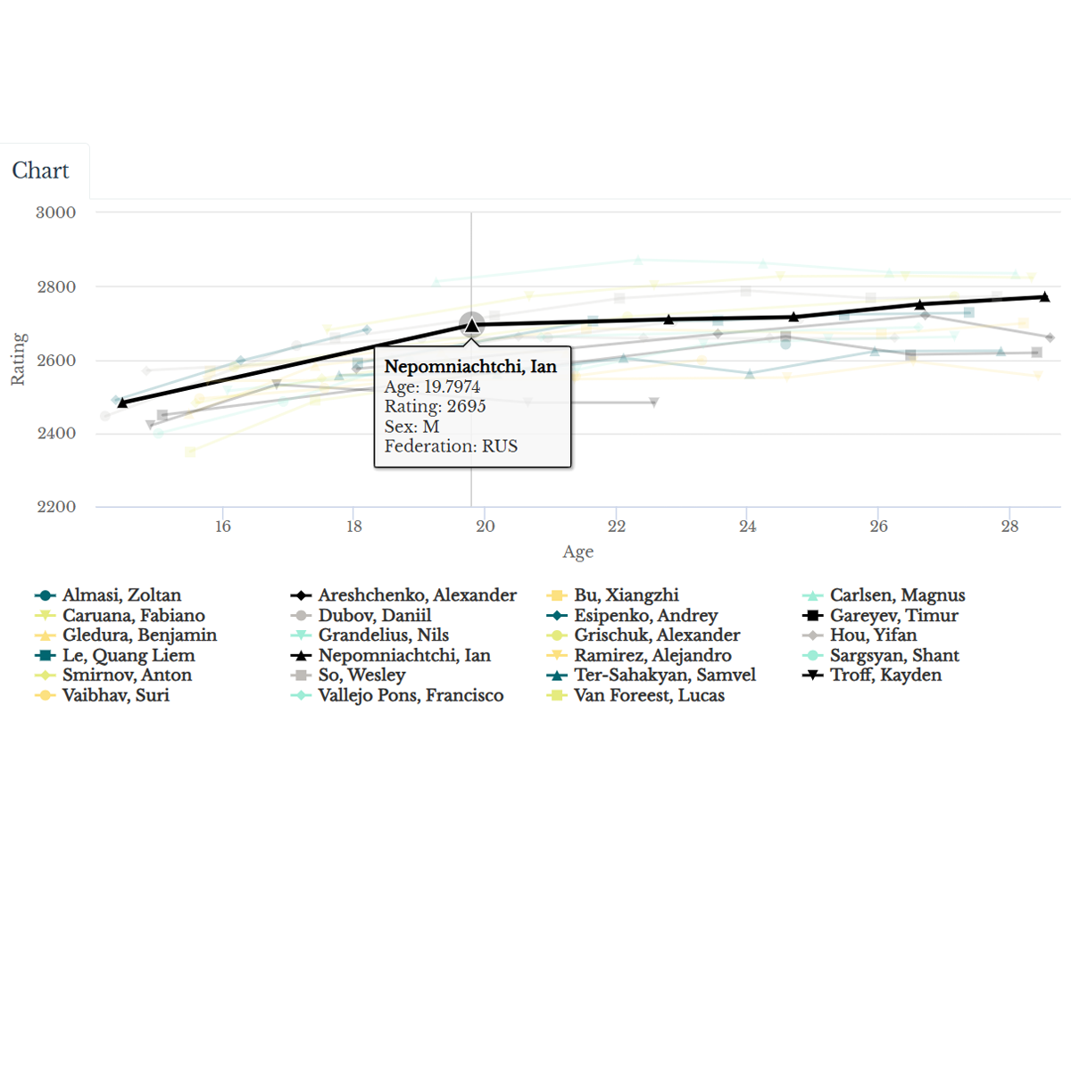
Pathway to Prodigy
Compare prodigies by age from 1970s-2021
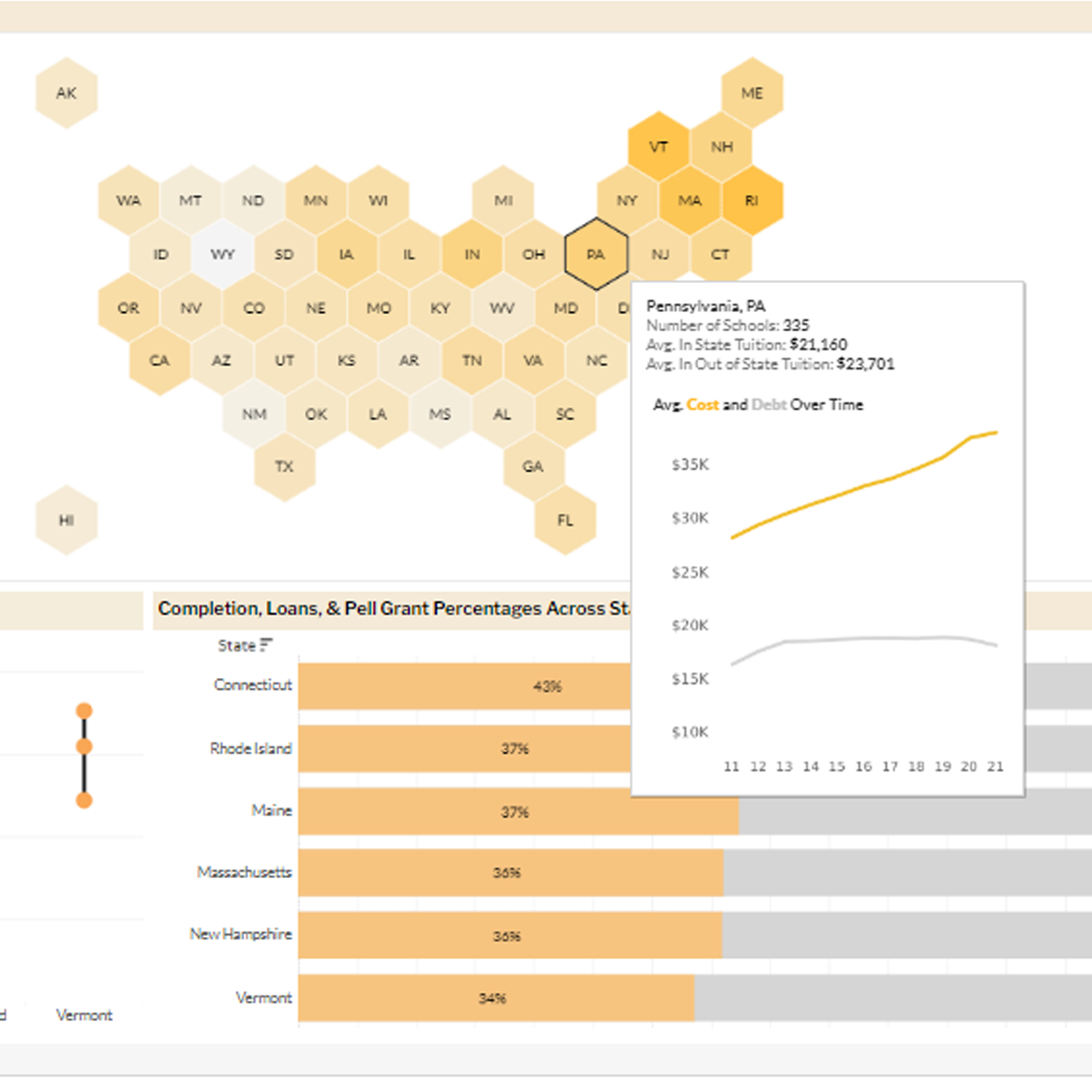
College Finances Over Years
Dashboard comparing cost, debt, earnings across US states.
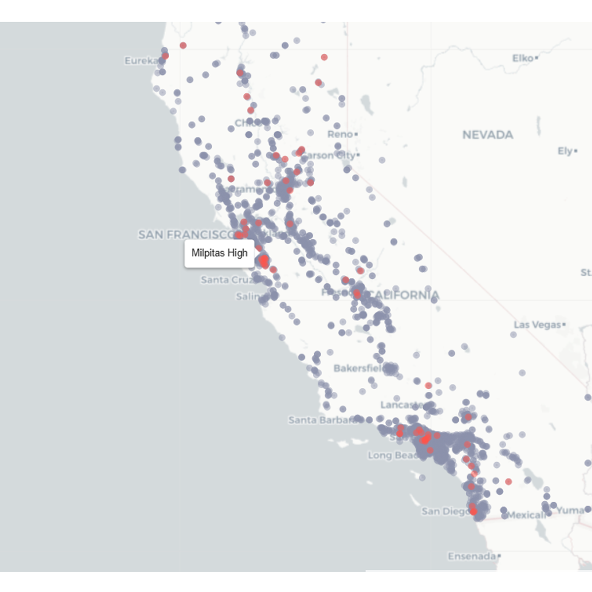
Investigating California High School Closures
Exploratory analysis examining factors that are associated with California high school closures.
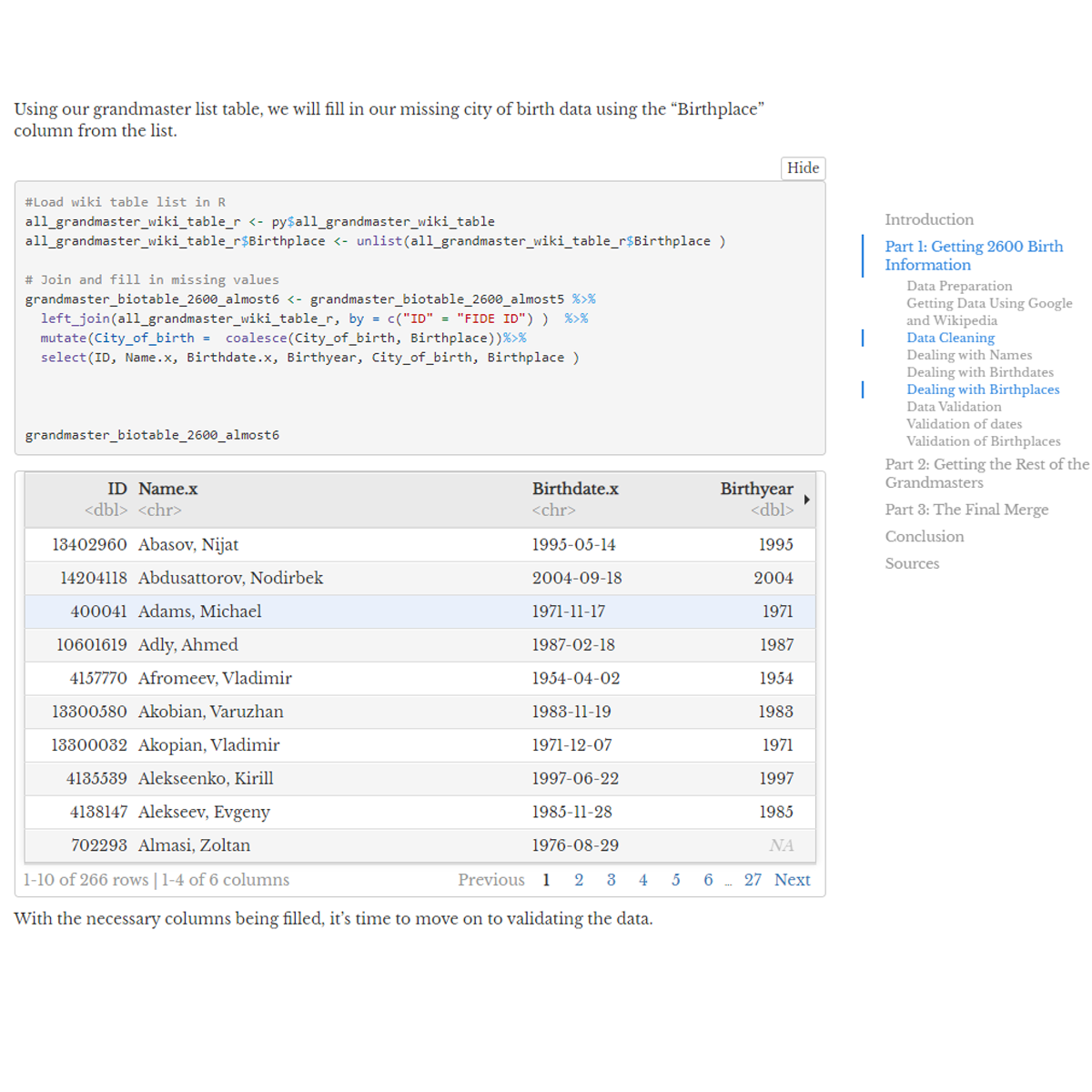
Grandmaster B-days and B-places
Gathering as many chess grandmaster birthdates and birthplaces using web-scraping tools.